CHORUS.AI

Standardizing Design Systems for Accelerating Enterprise Feature Production

Standardizing Design Systems for Accelerating Enterprise Feature Production

Timeline

2020 - 2021

My role

Product Designer (Contract)

Teams

Design, Product

Summary (TL;DR)

Summary (TL;DR)

Summary (TL;DR)

Through a strategic redesign and update to their design system, Chorus AI was able to ship faster, more effectively, and meet requirements set by their eventual acquisition by ZoomInfo.

Problem

A fragmented UI resulted in slowing development cycles, resulting in a disjointed feature implementation timeline.

01

Problem

A fragmented UI resulted in slowing development cycles, resulting in a disjointed feature implementation timeline.

01

Problem

A fragmented UI resulted in slowing development cycles, resulting in a disjointed feature implementation timeline.

01

Solution

By leading the standardization effort of their design systems, Chorus AI engineers were able to me more effective at launching new features.

02

Solution

By leading the standardization effort of their design systems, Chorus AI engineers were able to me more effective at launching new features.

02

Solution

By leading the standardization effort of their design systems, Chorus AI engineers were able to me more effective at launching new features.

02

Outcomes

We achieved a faster and more consistent delivery that supported its eventual $575M acquisition.

03

Outcomes

We achieved a faster and more consistent delivery that supported its eventual $575M acquisition.

03

Outcomes

We achieved a faster and more consistent delivery that supported its eventual $575M acquisition.

03

PROBLEM SPACE

Despite strong market traction, the product suffered from a fragmented design system that wasn’t truly a system at all


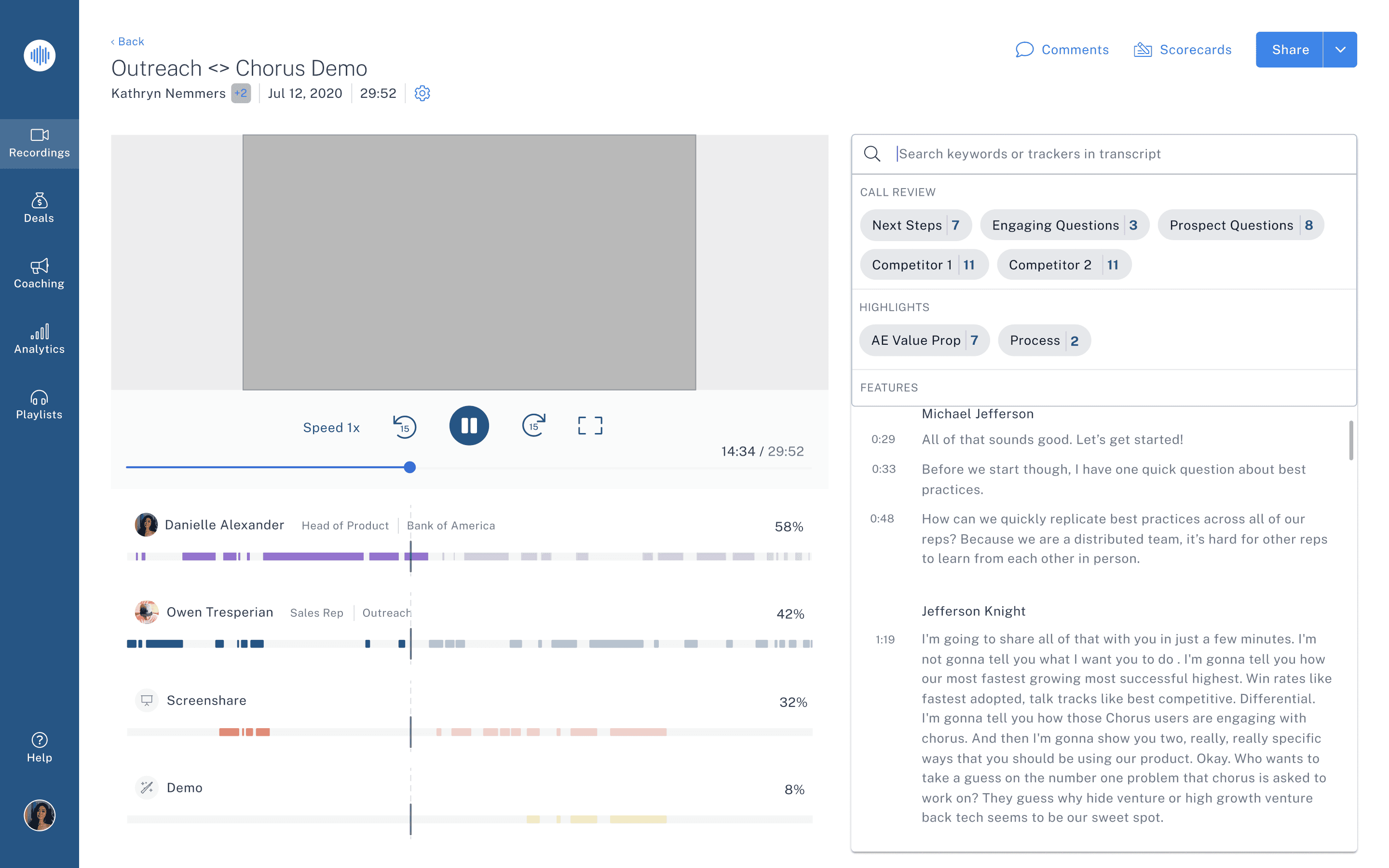
Developers rebuilt UI patterns from scratch for nearly every feature.

  • PMs struggled with unclear specs and last-minute design changes.

  • Designers kept redrawing the same layouts, introducing inconsistencies.

  • CRM plugins looked like entirely separate products.


This directly impacted our speed-to-market and eroded customer trust in our product quality.
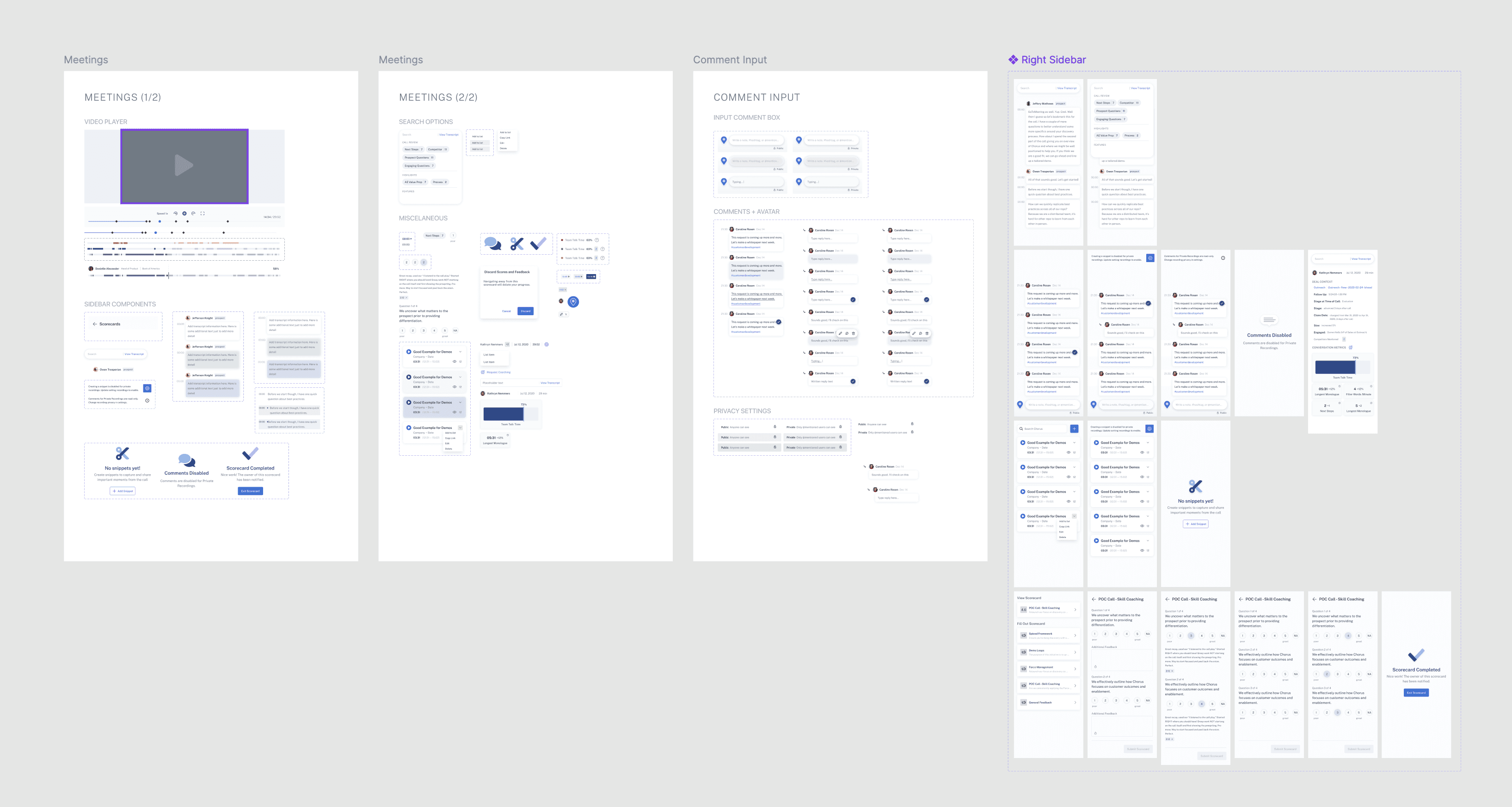

IDENTIFYING THE PROBLEM

Based on feedback we received from Engineers and PMs, it was clear that this was a crucial issue

  • Interviews: Engineers and PMs reported ~2–3 weeks of extra work per feature just to rebuild UI.

  • Audit: We found 15+ modal styles, 4 different button systems, and over a dozen recurring handoff errors each month.

  • Competitive Research: Our main competitor (Gong) had a more polished, cohesive UI that sales teams cited as “more enterprise-ready.”


These insights made it impossible to ignore: we needed to fix this to scale.

Our goals were clear

Our goals were clear

1)

Speed up development by standardizing reusable components.

2)

Ensure a consistent, high-quality experience across web and CRM plugins.

3)

Build a scalable design foundation to support upcoming enterprise integrations.

MY ROLE

As a Product Design contractor, I was responsible for delivering on the features for this new design system, consolidating components, and assisting with handoffs.

I wasn’t just making components in Figma. I was responsible for:

  • Setting the vision and scope.

  • Building buy-in with PMs, engineers, and leadership.

  • Designing, documenting, and implementing this system.

  • Standardizing repeatable patterns.

  • Driving adoption across teams.

We followed the Atomic Design Methodology for implementing these systems

We followed the Atomic Design Methodology for implementing these systems

Approach & Process

Approach & Process

Approach & Process

In order to deliver on these objectives, we followed the following steps as if we were creating a new 0-to-1 product.

Audit & Research

  • Catalogued every production UI pattern.

  • Ran developer and PM interviews to surface pain points.

  • Benchmarked best-in-class design systems (Atlassian, Shopify Polaris).

  • Identified critical gaps in coverage and documentation.

Prioritization & Scope

  • Partnered with PMs to define must-have vs. nice-to-have components.

  • Prioritized high-impact areas like navigation, forms, modals, and CRM plugin consistency.

  • Balanced engineering constraints and roadmap needs to avoid blocking feature work.

Defining styling patterns

  • Created and documented all corresponding branding guidelines

  • Implemented them throughout Figma tokens

  • Collaborated with engineering to establish new design tokens (CSS)

Design & Build

  • Rebuilt the entire component library in Figma with variants, tokens, and responsive grids.

  • Created page templates to ensure consistency beyond atoms and molecules.

  • Documented usage guidelines, edge cases, and accessibility considerations.

Meetings

Meetings

Meetings

Before

Before

After

After

Playlists

Playlists

Playlists

Before

Before

After

After

Recordings

Recordings

Recordings

Before

Before

After

After

OUTCOMES & IMPACT

We didn't just ship a new library, we changed how Chorus approaches building software.

Reduced UI bugs and rework by ~30% (tracked in Jira).

Reduced design-to-dev cycle by 50%

Achieved an 82% success rate across products.

Have a project in mind? Let's chat!

Let's connect

©2025 SebMendoDesign

Monday, 8/25/2025

Have a project in mind? Let's chat!

Let's connect

©2025 SebMendoDesign

Monday, 8/25/2025

Have a project in mind? Let's chat!

Let's connect

©2025 SebMendoDesign

Monday, 8/25/2025